Case Study: The Paul Martin Team — Real Geeks Sample Websites
Are you a Real Geeks client looking for Real Estate Website Designers?
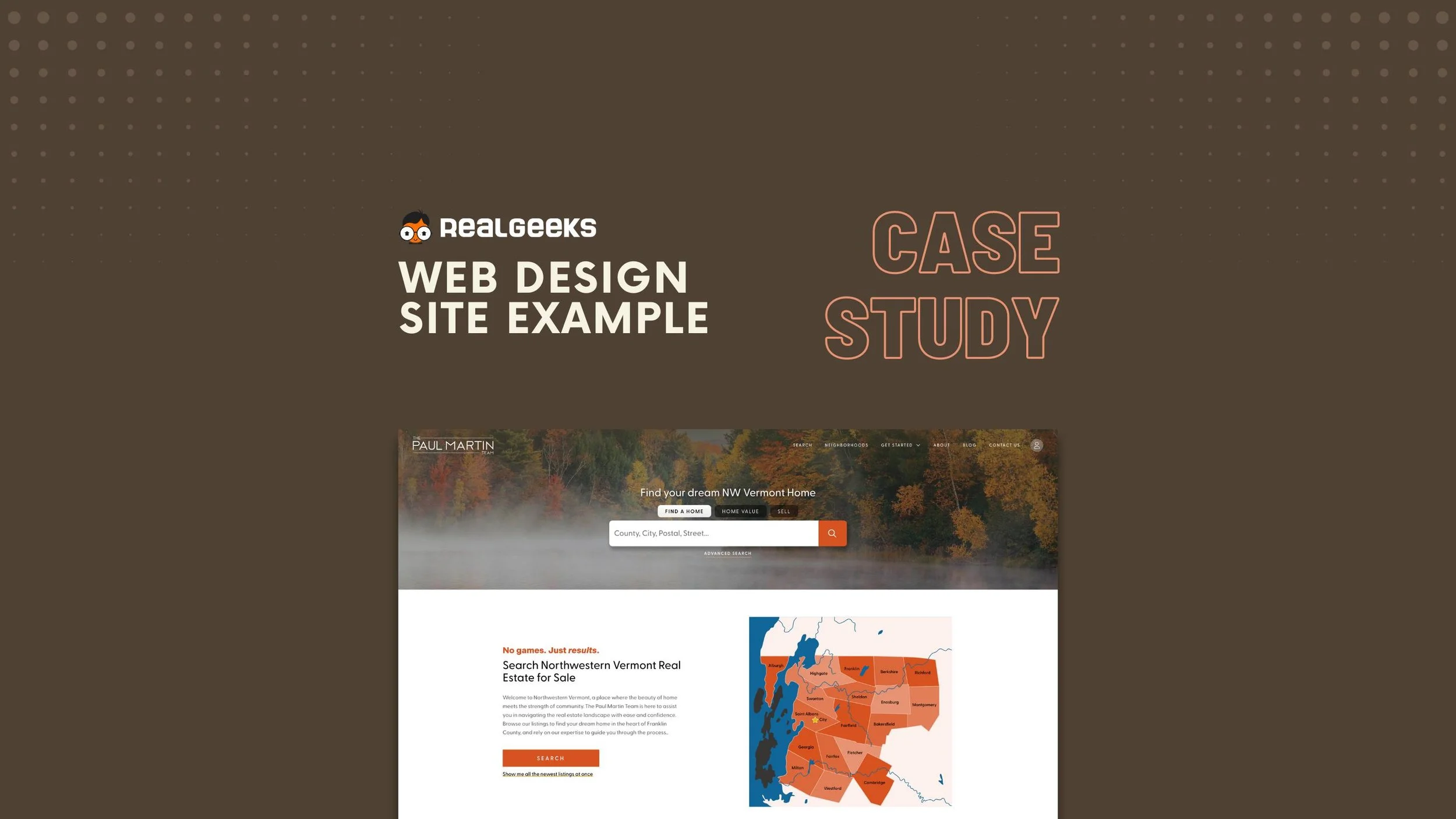
We have been designing Real Geeks websites for years, improving user experience, brand awareness, conversions, and ensuring you stay relevant for years to come. We are excited to bring new luxury real estate web designs to the Real Geeks community in 2024, including this newly launched site from The Paul Martin Team.
Real Geeks Website Design: Creating a local brand
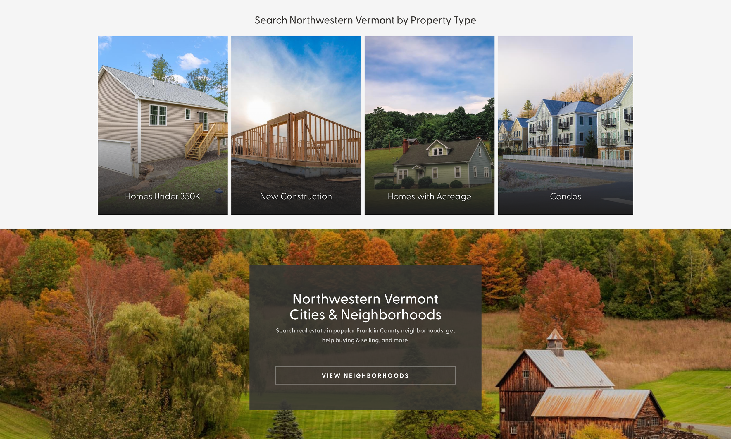
Paul came to us with an extremely specific vision in mind — create a local brand for the Northwestern Vermont real estate market that was recognizable, unique, agent-centric, value proposition oriented, and most importantly — a site his clients actually want to use.
Attracting the Right Real Estate Clients to the Real Geeks site
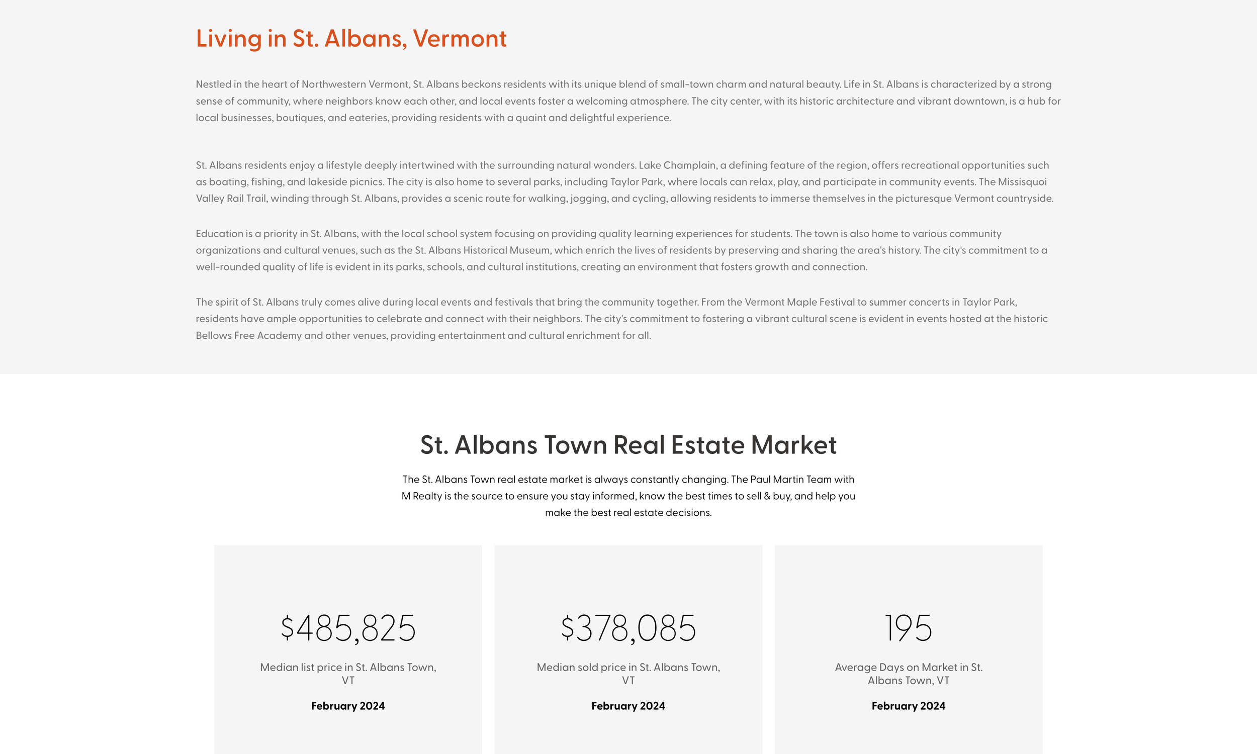
Like all the sites we do, we take the time to understand the local market, and what organic traffic is searching when beginning their journey to buy or selling a home. Surprisingly, all markets are different in some sense. Paul’s site required a hands on, in-depth approach to achieve his vision with his Real Geeks site. A template just wouldn’t do it. We had to execute the following:
Keyword research of the NW Vermont real estate market to reverse engineer the proper pages to attract the right traffic.
Design strategic area pages with relevant call to actions and maintain order of importance with elements to ensure lowest bounce rates.
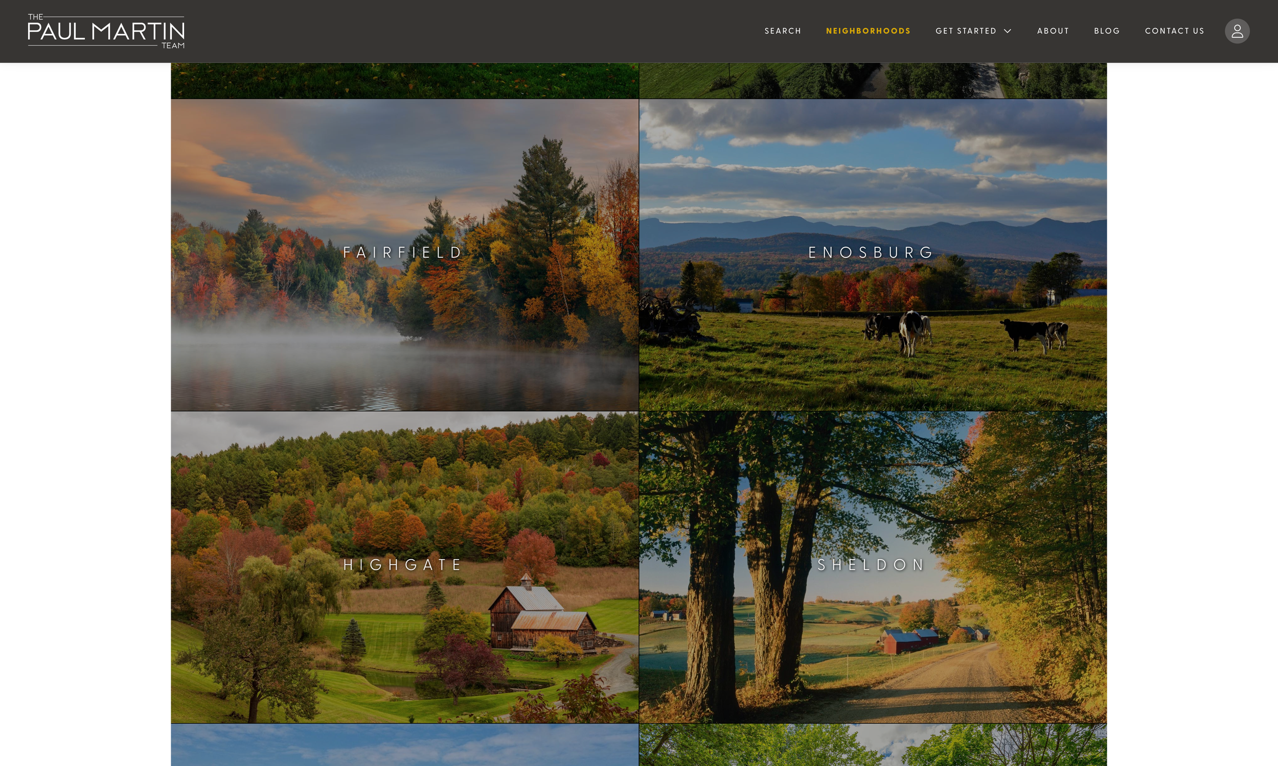
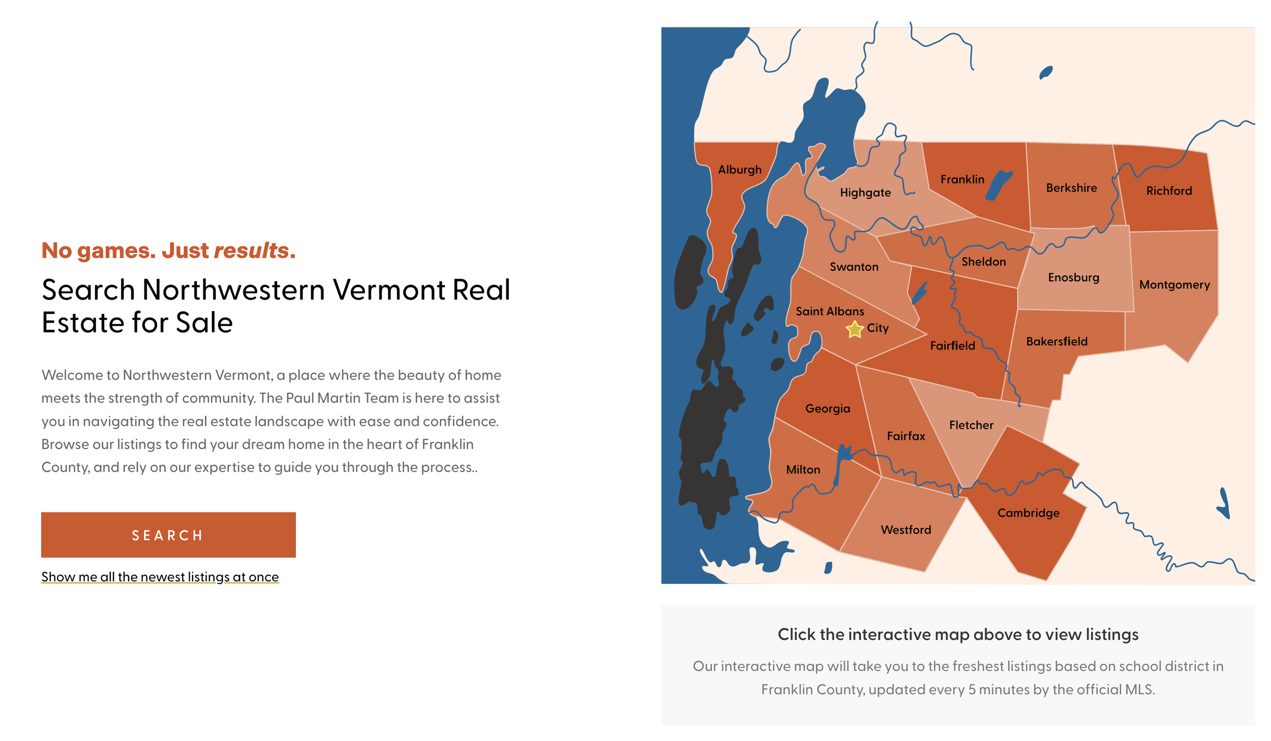
Design a scalable, vectorized clickable map NW Vermont. We had to include a few areas outside of the one county he served — so conveying a message to the user visually in the most straightforward way was crucial. See below.
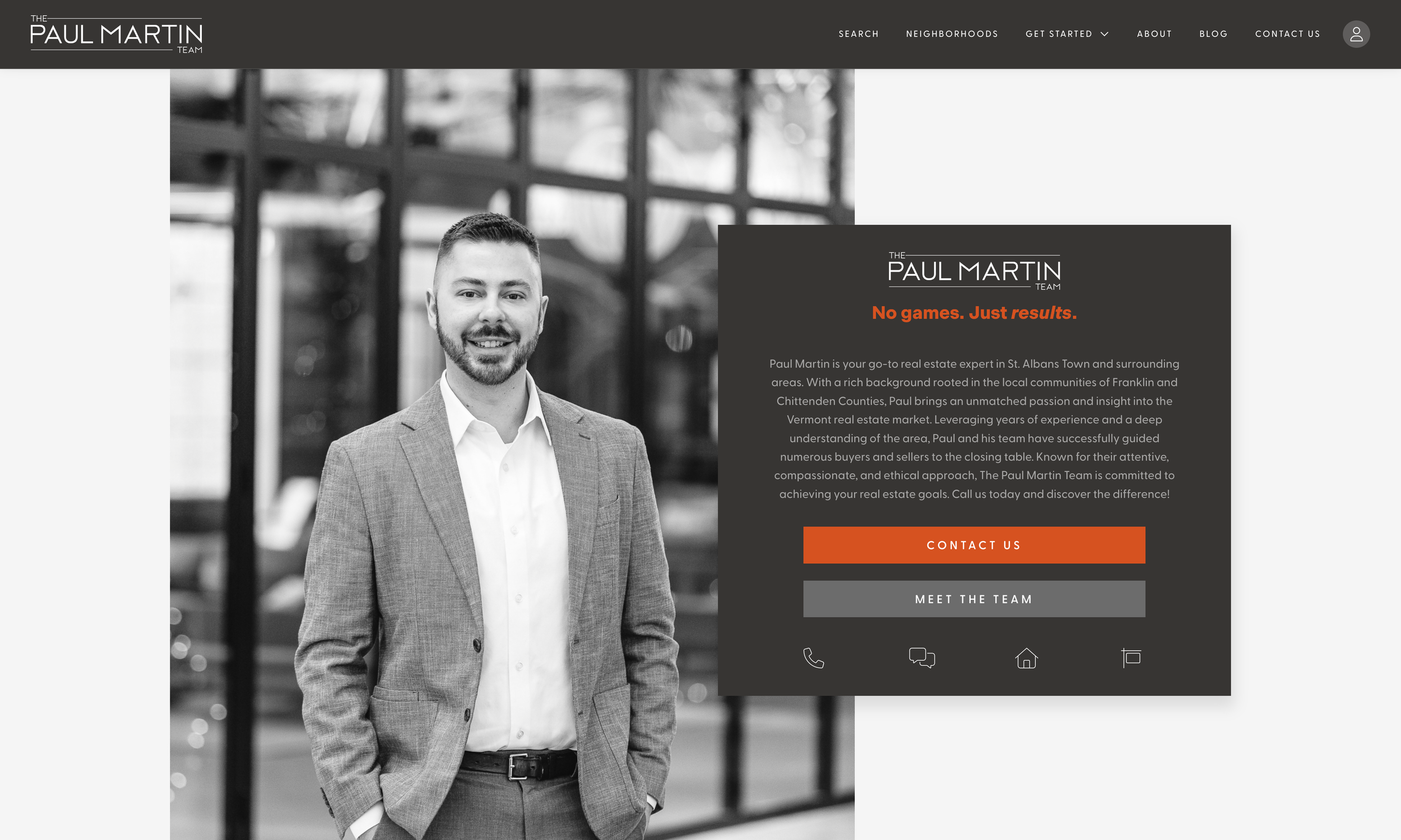
Conceptualize a “orange” toned color palette that would be memorable, unique, but also sleek + modern.
Ensure the presence of Paul as the premiere agent on most pages without over saturating or over selling him. Most new traffic care less to see an agent immediately upon viewing content, but the right placement will psychologically sit well with new users.
Ensure the sustainability of the site design structure so that Paul can continue to add content and grow the site.
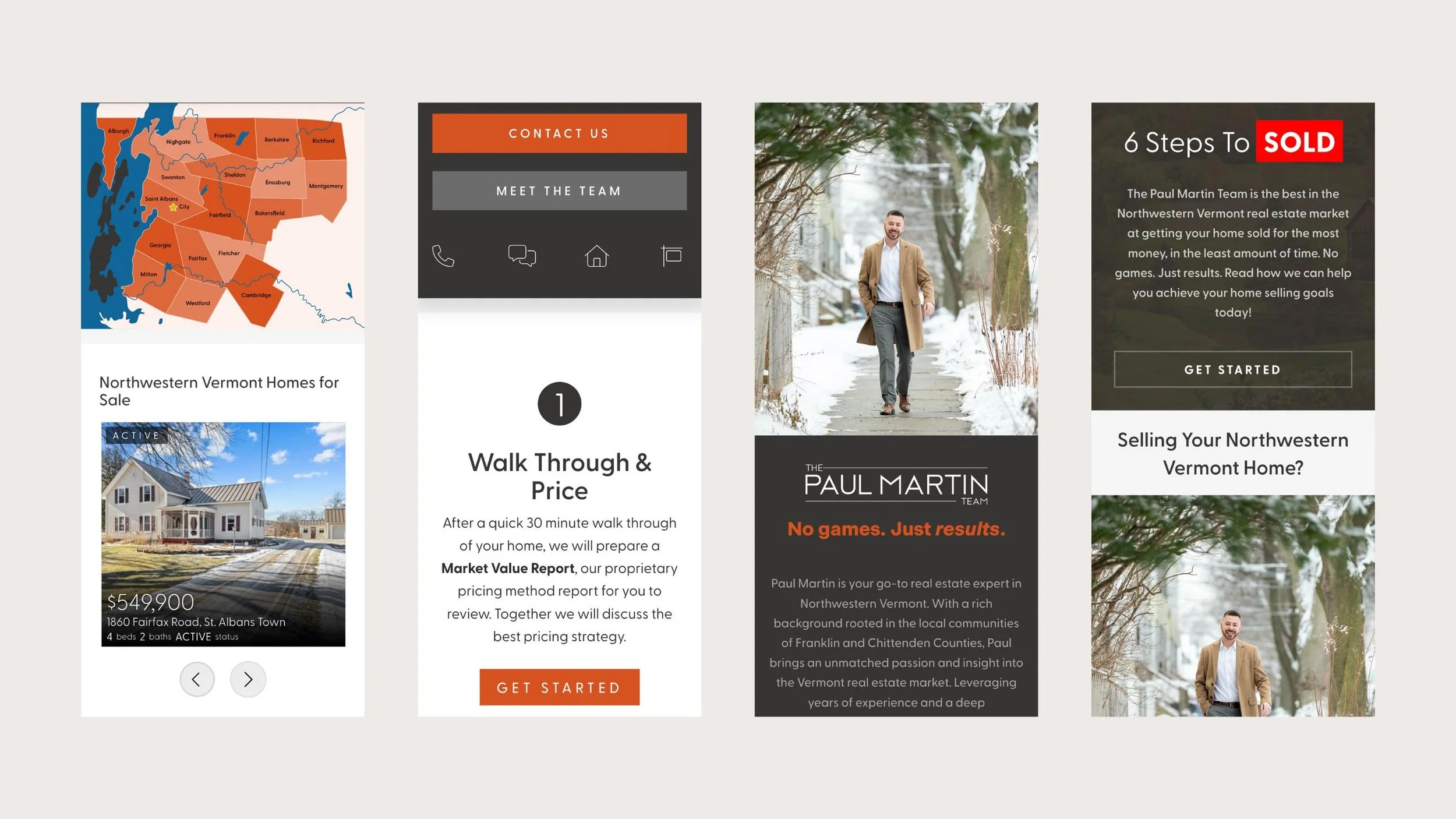
Mobile friendly is everything. See below.
Brand Identity Through Uniquely Tailored, Local Visuals
Sometimes the most subtle things will invoke an incredibly high level of credibility. We wanted Paul to stand out amongst the sea of real estate agent websites in his area. We noticed that not one agent in his market had a clickable map. This adds a super unique touch to his site and ensures users can quickly find listings in the city they are looking in. As with all markets, Paul’s traffic is mainly mobile so this site was also designed with mobile in mind, ensuring that no matter the device, the user can easily click an area.
A Mobile Friendly Real Geeks Site
We needed to make sure his website was mobile friendly, did not shift upon load, and had a premium user experience. Compared to his competition, he easily rises above with the most unique, sleek user experience.
Want to see more Real Geeks Website Examples?
This is just one Real Geeks Website example amongst many that we have implemented. Check out the recent blog below we wrote to see more. And of course — if you have any questions, please don’t hesitate to reach out! We are more than happy to conduct a live demo or Zoom call anytime.

Discover the next generation of Real Geeks websites built for 2026’s AI-driven landscape. Today’s visibility game isn’t just about keywords—it’s about how your site performs in search, social, and AI discovery. We specialize in transforming standard Real Geeks templates into intelligent, brand-centric ecosystems that speak fluently to both humans and algorithms. Our sites combine custom design, advanced UX, and AI-optimized SEO architecture to boost visibility, authority, and conversion. In a world where generic doesn’t rank (or get surfaced by AI), your Real Geeks site should be memorable, data-smart, and unmistakably yours.